Hi guys, I hope I don't sound like an asshole with this topic, but I figured I might as well bring it up. What kind of criteria do you use to pick the fonts for your translations? I saw the news of La Wares translation and I'm pretty hype about that
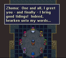
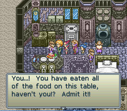
But then I saw you will use the same font as you used in Burning Heroes
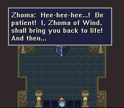
I confess that I kinda disliked that font... to the point it makes me hard for me to play Burning Heroes. I have no idea why that happens, I know this font is perfectly fine and readable... but... I don't know... it feels kinda plain, and doesn't add much to the general feeling of the game, in my opinion.
I hope you don't think I came here to bash on your work. I really love what you guys do and I'm really grateful for all the games you have translated. I don't think it's an issue to really fret over. I bet I'm the only person in the world who is bothered about that
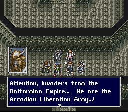
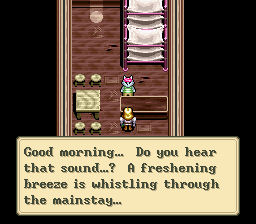
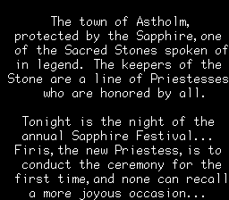
Just for comparison, I'm gonna list here some screenshots of previous projects you guys have worked on. I feel like the fonts used in those give more... personality to the games...
I'm sorry if I sound whiny or if I offended someone. I wanted to offer some constructive criticism. But, again, probably this doesn't bother anyone else.
Anyways, I think you guys are awesome and keep up the good work! ^^